Showing posts with label Planning. Show all posts

Sunday, 3 April 2016

Contents Page Photo Shoot


I took many photos for my contents page photo shoot, I am showing here the better photos. Some photos had to be discarded due to the photo going wrong. As this shoot was for my contents page, I will be able to use a few pictures rather than limiting myself to one. The picture to the left could be used as a large main article photo as it has the character from my double page spread. Also, this photo could be cropped to just show a tall portrait image of the character. 


The photo of the guitar on the right hand side      could be used as a competition advert as the lighting make the guitar look appealing to a reader. 

I intend to also use a photo of my character 'black widow' on his own so that I can advertise that as an article as well.I am thinking of using the photo of him leaning over the balcony as it looks as if he is deep in thought.


I will use the bottom left photo as it has an interesting story behind it as an article. This would be to portray it as a backstage article.


Saturday, 26 March 2016

Development of Double Page Spread

This is my mock up double page spread as I am only half way through the development.

Sunday, 20 March 2016

Double Page Spread Photo Shoot


These are the photos taken during my final photo shoot. This photo shoots purpose is for my double page spread which will be featuring 'Blind Eye' once again. All the photos have a basic hallway background but I decided it is irrelevant as I plan to cut out the background anyway. I just needed good lighting which is achieved through the skylight in this hallway.


I took a range of shots starring different angles and positions.

There were many more similar photos of each photo displayed here but I chose these as the final seven because they have no blur and portray what I wanted to image to look like. Whereas some photos didn't fit in my magazine conventions due to the models smiling or misunderstanding the shot. As much as I like the top right photo, I struggle to see how I would fit it into my double page spread so I will most likely have to not use it. I am thinking of having the members on either side of the page, both facing in on each other. Therefore I could use either both the middle photos to the sides or either one of the bottom corner pictures.

Monday, 22 February 2016

Contents Page Further Development

This is one of my final drafts for the contents page. It continues the main article feature about the band 'Blind Eye'.


Wednesday, 13 January 2016

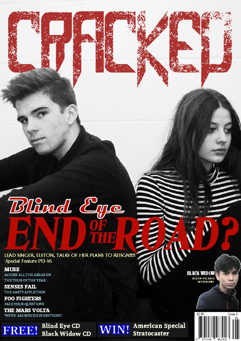
Front cover photo shoot selection

I took a series of photographs for my photo shoot. All the photos were taken indoors, in a school corridor with lighting from a high window.  Below are all the photos I took.


I chose not to use these photos because I felt that the expressions and the body positions were wrong and did not represent the idea for the story behind the article.


I chose this image for my front cover because it fitted my story perfectly. The facial expressions from both characters was exactly how I wanted them to be. Also by the boy looking directly at the camera it shows that he is still in the game and serious about what is going on. Whereas the girl looks sad and stares of into the side of the image cause she is upset about the circumstances and is leaving the band.


This final photo was taken at the end of my photo shoot and included someone who hadn't been in any other of the photos. At first I did not even think of adding this photo but now I have realised that I could use the middle boy as a secondary image. Therefore I cropped out the original characters and background and was left with a secondary image to put on my magazine front cover as another convention.

Tuesday, 12 January 2016

Audience Feedback

To gain audience feedback on my front cover so far, I filmed myself asking people questions to gain their feedback of my work. I showed the people I asked questions to, an image of my front cover on my computer screen so that they could see it in colour before I gave them a grayscale printed copy. This image below is the front cover at this point of my project. I aim to use the feedback I get to improve my front cover and develop new ideas.


Below is the video of the 3 people I interviewed.


From The answers I received I now know some ways to improve my work such as changing the blue bordered font at the bottom of the page. Although I am choosing to ignore the response about magazine price from interview 2 and interview 3. This is because these students do not study media and did not understand how many music magazines cost double the price of my magazine.


Sunday, 13 December 2015

Planning for Front Cover Photo Shoot

For my photo shoot I am going to use some characters for my front cover and then the same ones for the double page spread. For my contents page I will take photos with other photos as they are for other articles.

The story behind my front cover will be a famous band splitting up. I will use this same article for my double page spread. the photo shoot for my front cover will be taken up against a brick wall so that there is nothing else in the picture distracting you from the cover models. The two band members will have their backs tilted from each other because they are splitting up. Both models will have serious expressions because these are hard times for the band. I want the models to be wearing smart casual clothing because that is their image as a band. I will have bright lighting so that the picture is clear. I will then edit my photo further on in my project to make the photo stand out more.

Sunday, 29 November 2015

Lifestyle Survey

As part of my research to help me design my magazine, I have created a lifestyle survey to understand my target audience and learn the ways to present my magazine. The link for my survey is https://docs.google.com/forms/d/1Z8224duGisq3Fmaxyg36ha5SJdB3CuyNrtkdKs7HK_o/viewform

I posted my survey on a social media website asking if people could fill it out with their own information. My results are formatted in a spreadsheet so the the answers are easy to read. The link is https://docs.google.com/spreadsheets/d/1pxyF7OA1w9V5NAQVb0QLEQ1E57622JE39_vNMHfKSEU/edit?usp=sharing

From my survey I have been able to work out that my target audience is mainly males. This is because the majority who said their favourite gender was rock, were also male. Most of the people who said rock was their favourite genre also said that Kerrang! was their favourite magazine. From this I shall study the colours and techniques used on Kerrang! magazines to help theme my own magazine. My results also show that people who prefer rock music to other genres generally go to more gigs than other people. To act on this result I will add more articles about upcoming gigs to my magazine. My results also show me that my target group is definitely between fifteen and thirty year olds as all the responders that choose rock music are between that age group. Those participants who fitted into my target audience all liked similar themed colours. These colours are grey, red and black. I am aiming to use this colour scheme as much as possible in my magazine because it will attract my target audience.


From my results I have decided that a price of £2.50 will be right for my magazine due to my results on the 'price you would pay for a magazine every week' question. Overall most people were prepared to spend less than £1 on a magazine every week which you can see in the graph below. I am choosing to ignore the overall response and only concentrate on my target audiences responses which is how I have come up with the price of £2.50.


From my results I have been able to identify the most preferable articles to read. Many of the participants stated that they liked reading about gossip. I have chosen to ignore this field due to the fact that people who like gossip do not come under my target audience. Therefore when I design my magazine I will include more articles about the 'New album releases' than 'Gigs' and other topics.


Those who liked pop music generally went for Ed Sheeran. I expected this as he is a huge pop icon. Those who liked rock music, liked bands such as Artic Monkeys and Green Day. I will use this result for variation in the issues of my magazine as Artic Monkeys and Green Day both aim for a different image.


Friday, 9 October 2015

Planning my Photo Shoot - Preliminary task

For my preliminary task I need to design a school magazine. My magazines issue will be focusing on year 7 stress and how to overcome it. It is a good time for this article as new students to secondary schools have now been in school for five weeks and would now be facing problems from homework and intense lessons. My plan for the cover photo will feature a year 7 struggling with their homework at a desk. The student will be stressed and feel upset from the workload. I will use a mid shot from a side view.